
Nicole Klassen
Speaking and Training

Need a speaker or trainer?
Here is a sample of trainings and presentations I have given over my career. If you need a data visualization and storytelling trainer, please reach out!
Some topics include: Data Visualization for Nonprofits, Intro to Tableau, Advanced Tableau, Data Visualization 101, Data Visualization Design 101, Ethical Data Visualization and Data for Good, The Art and Science of Giving Feedback, Intro to Power BI, and more!
-
Introducation to Data Visualization: This tool agnostic training dives into the difference between exploratory and explanatory data visualizations, and gives a high level overview of the building blocks of data visualization.
Data Viz 201: Going deeper into data visualization principles, this course is still tool agnostic. It dives into understanding bias in data and how to avoid causing harm with our visualizations. It also touches on how to avoid misleading visualizations and instead deliver high-impact visuals.
Tableau 101: Dive into Tableau and start to see and understand your data! Using your data, we dive into the nuts and bolts of Tableau so you can start to deliver insights for your business.
Excel 101: Just like Tableau 101, dive into visualizations in Excel to make impactful reports and presentations.
-
Pre-conference workshop: Intro to Tableau for the Southern Association of Institutional Research (SAIR) conference: This four-hour pre-conference workshop used higher education data to dive into the nuts and bolts of data visualization principles and Tableau.
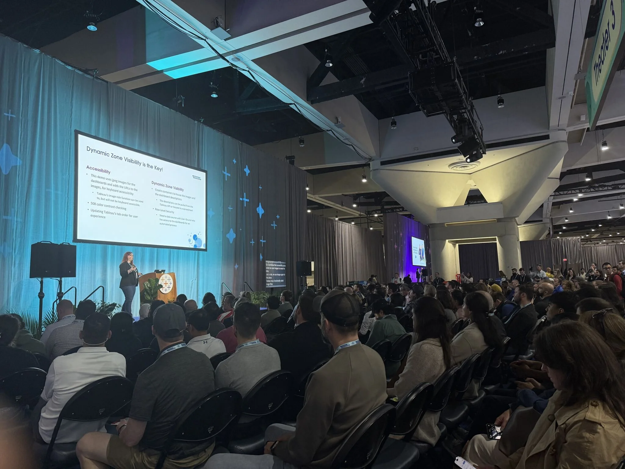
Tableau Conference 2025 - Creating a Dynamic, Accessible Landing Page: Combining Dynamic Zone Visibility, Row-Level Security, and Keyboard Accessibility, we show how to build dynamic landing page in Tableau, showing users only the dashboards they have access to see.
Tableau Conference 2024 - Data Visualization for Social Good: In this panel discussion, four of us discussed how data visualization can be used as a force for social good. Unlike Superstore Data, visualizing data on people comes with its own challenges but also it’s own opportunities.
Tableau Fringe Festival 2022 - Curating the Perfect Story: Whether you’re building an explanatory infographic or an exploratory business dashboard, dashboards and reports need to tell stories in order for users to find actionable insights.
Tableau Fringe Festival 2022 - The Etiquette of Feedback: Giving feedback is a powerful tool to help developers grow, but it can also be used to denigrate others. This course reviews how to give feedback in a positive manner that fosters growth.
There was a conference in Ohio; remember what that was.
Did I speak at AIR?
-
Spending a week in Zambia and Malawi, myself and two colleagues delivered a full day workshop on data visualization and data storytelling, then spent the remainder of the days in hands-on workshops, helping take their required presentations and transform them into data stories that show the amazing impact of the work they are doing, so they could continue receiving funding.
-
Viz for Social Good Year End Celebration: 2023
VizConnect: Data Storytelling
Tableau User Groups:
Visualizing Mental Health Data
Collaborating in Tableau
Dashboard Design